Interface Aesthetics – CDTM Elective 2020

Again, in 2020 this elective inspired from a lecture of UC Berkeley was offered to active students and Alumni at CDTM. In a very interdisciplinary setting ranging from designers to complete newbies to the topic the course offered four input lectures and assignments to practice the theory. At CDTM the innovators of tomorrow are connected, educated and empowered. The aim of this elective was to provide a new toolset to the students to feel empowered and educated when designing their prototypes and talking or giving feedback about interface aesthetics. How do I design a screen? How can I communicate with a designer? How do I give a design critique? Throughout the different sessions and assignments all these questions were answered and practiced.
Why are interface aesthetics important for creating successful products?
Have you ever scrolled down a website, changed tabs, went back to the home screen and still you couldn’t figure out what they offer, or sell, or where the button is you are looking for? Probably you didn’t last more than 30 seconds on such a website. You googled again and looked for another company offering a similar service, but with a very clear and nice-looking website. This is the key. You can program a product that has incredible functionalities, but if it is not intuitive, compelling from a design perspective and doesn’t give you joy to use, you won’t find many customers. Beautiful things simply make us more happy.
My background is in Electrical Engineering and my knowledge about interface aesthetics was almost non-existent when I started the elective. Many of us use our gut-feeling when analyzing an interface and say things like: “In this screen something feels off.” And very often we can’t say exactly what it is. In this elective I have learned to understand what is that feels off in a screen and which guidelines should be considered when designing a screen or which rules broken in certain occasions.

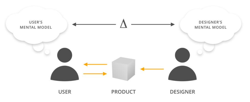
Source: https://www.nngroup.com/articles/mental-models/
What were the teaching modules of the interface aesthetics elective?
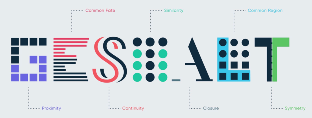
Everything started with the Gestalt Principles. Franz Zünkler, Industrial Designer and Centerling from Class Spring 19 introduced us to the powerful world of Gestalt.
- Proximity: Items that are related should stay close to each other.
- Continuity: Elements arranged in a line or a soft curve are perceived to be more related than those arranged randomly.
- Symmetry: Symmetrical elements tend to be perceived as belonging together regardless of their distance, giving us a feeling of solidity and order.
- Similarity: Elements sharing similar visual characteristics are perceived to be more related than those not sharing similar characteristics. COLOUR > SIZE> SHAPE
- Common Region: Elements placed within the same region are perceived as grouped.
- Closure: A group of elements are often perceived to be a single recognizable form or figure. The Closure also occurs when an object is incomplete, or parts of it are not enclosed.

With these principles you can create a visual hierarchy in your layouts. For example, through having similar shapes, colors or proximity you group them together and can highlight a certain aspect by making it different to the rest of the group. Another important aspect produced by following gestalt principles is balance and rhythm. You can create a very harmonious and balanced screen depending on where you place your objects. Dynamism can be introduced into the screen by giving the objects a certain rhythm.
Keep in mind, that interfaces produce emotions and depending on which emotion you want to convey you should design your screen accordingly.
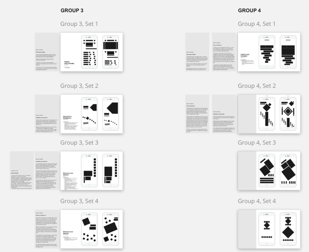
How did we practice the gestalt principles? By using black blocks and designing weather apps! These screens in the image below convey different emotions as whimsical and delicate, or dynamic and fierce.

The second lecture was held by Maximilian Wühr, founder of Finn Auto and Centerling from Class Fall 16. In his lecture we learned everything about typography. He explained to us how typography gives personality to a screen depending on the font type. You can choose a serif or sans serif font, you can design the size of the letters and words, and you can use kerning to define the distance between letters. All these tools help you create more attention towards certain words and provides readability to a screen. We also learned how different font families can be combined, but not all of them work well together. Max also provided us with a set of rules to follow when thinking about combining different font types:
- Limit the number of fonts
- Avoid fonts that are similar
- Find fonts from different categories that have similar x-heights and letter widths
- Contrast, not conflict

We practiced this by designing again weather app screens that contained only text. In the following images you can see one design that wanted to convey a whimsical and delicate emotion and the other a dynamic and fierce one. Which is conveying which emotion?
The next topic we covered was layout & grid. This topic was introduced to us by Michael Fröhlich, current Center Assistant of the CDTM and organizer of the elective. In this module of the elective, we learned how important the layout of a screen is. It provides structure to content, makes screens easier to navigate and improves the understanding of complex information. The grid is the tool that brings order into a layout and there are different types of grid that can be used. There are single column grids, multicolumn grids and modular grids. In modular grids, as the one in the picture below, there are different elements and rules for using it. The grid supports you in creating your design, by making the elements in your screens be aligned and in balance. It is also important to consider that sometimes the grid needs to be broken in order to make an emphasis on a certain element of the screen.
How did this course affect me?
As I mentioned at the beginning, I had no clue about interface aesthetics when I started the elective and I considered myself to be someone that has little knowledge about design. During the elective I felt quite overwhelmed at some points when I was trying to design a weather app just out of black rectangles. But now, having this theoretical foundation, having applied the rules and methods hands-on on my own designs and having written design critiques for the screens of my peers, my perspective of interface aesthetics has completely changed. I now believe that I can understand the underlying elements that make an interface appealing and compelling. I feel empowered to talk about design and give feedback to screens in a structured way. I would probably still hire a professional designer to design the interfaces of my next unicorn start-up, but for now, I know the foundations, can be part of the design conversation and can start designing my own interfaces.
What is the CDTM?
The Center for Digital Technology and Management (CDTM) is a joint institution of the two universities in Munich, the Ludwig-Maximilians-Universität München (LMU) and the Technische Universität München (TUM), offering the interdisciplinary add-on study program Technology Management.
Students from various study backgrounds with creative ideas, great motivation, and an entrepreneurial mindset are offered the tools to put their ideas into practice. Find out more about the CDTM here.